GfK Newron:
Design System

Establishing GfK's first global design system, and leading the UI direction for Newron - the company's flagship B2B market-intelligence SaaS.

Role
Design system & UI lead
Sector
Market research · Enterprise data
Disciplines
UX research · UI · Design system · Creative direction
Context
In-house · Newron platform
GfK Newron - B2B market-intelligence SaaS, data visualisation and dashboard composition built on the GfK design system
The brief

A complex product ecosystem needed clearer foundations - fast enough to support delivery, robust enough to scale.

GfK provides global research powered by data science and AI. Newron is the company's flagship B2B market-intelligence SaaS, used by analysts and decision-makers across consumer goods, finance and retail.

I was brought in to establish GfK's first global design system, then asked to lead the UI output across two parallel Newron workstreams.

Strategy

Cheat sheet first, library second.

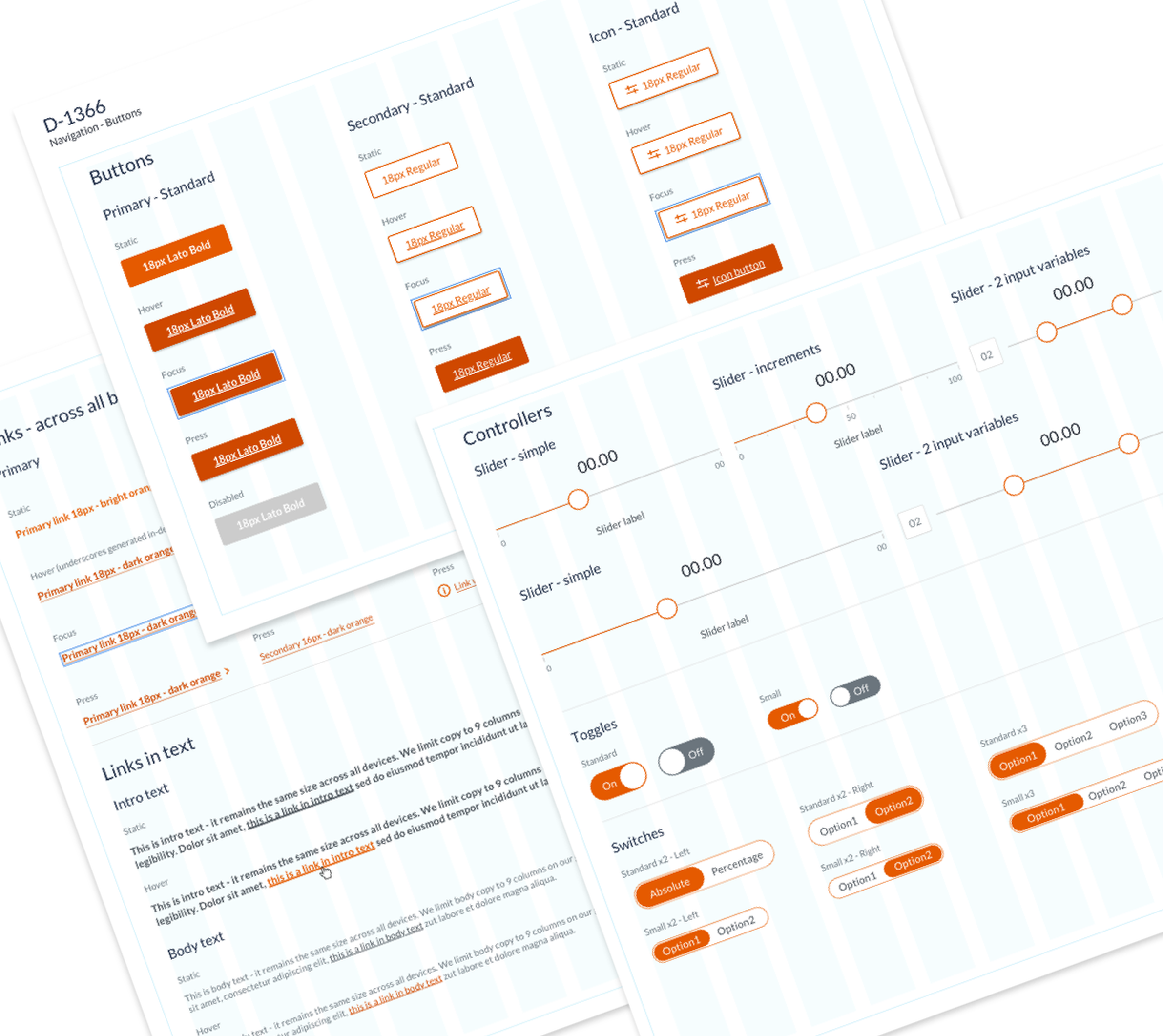
Before the full system existed, the team needed a practical way to align UI output immediately. I created a quick-reference guide covering grids, type hierarchy, colour, responsive behaviour, mobile-first principles and accessibility - giving the team a shared baseline while the formal library was being built.

Quick-fix pass on Newron - Design Before / Simple Styles Applied comparison with annotated improvements

Foundations - quick-fix pass on Newron headers

Audit + taxonomy

A full pattern audit, mapped on A3.

Alongside the interim guide, I ran a comprehensive audit and taxonomy of GfK's existing and legacy applications, benchmarked against best-practice references. The output was a set of A3 artboards - one per pattern family - creating a clear view of what existed, what was inconsistent, and where new system decisions were needed and could be prioritised.

Pattern audit and taxonomy of GfK's existing applications, organised across A3 artboards

Pattern audit and taxonomy - A3 artboards

The Sketch library

Reusable components, released with discipline.

Buttons, controllers, forms, tables and data visualisation patterns were built as Sketch symbols and rolled out across three formal library releases. The team could contribute components in working drafts, but each element had to meet a defined best-practice bar before entering the released library.

GfK Sketch library - data display patterns, charts and visualisation components in context
GfK Sketch library - interactive components, forms, tables and data controls in context

Sketch library · data display

"From a team shipping without a system to a Sketch library on its third release - and a Design System recognised across the business as the foundation for future GfK products."

Project note

Outcome

Foundations the company could build on.

I left GfK with its first global design system in place, a Sketch library on its third release, and a design team working with clearer standards, stronger production habits and shared UI principles.

Disciplines: UX research, UI, design system, brand and creative direction. Stack: Sketch, Zeplin, Atomic Design principles.

Top